Blog
Kayak and Trivago Enhance Destination Search Experiences
Published August 8, 2019
by Dana Field

Providing a better search experience for users is always top of mind for metasearch publishers. Recently, Kayak and Trivago have enhanced their user experiences in an effort to provide more relevant information to users on their booking journeys. We will dive into these enhancements to Kayak’s map view and Trivago’s calendar and filtering experience.
Kayak: Improved Map View
Kayak users will notice an update to the map view, which now highlights points of interest such as sightseeing, eating, shopping, nightlife, and public transport relative to the hotels displayed in the user’s search results. The map view is still accessible in the same location. After searching for a hotel and ending up on the results page, a user can navigate to the top left corner and click the “Go to map” button.
Doing so will open an expanded map view for the user with the organic property listings shifted to the left-hand side of the page. Once in the map view, the user can select icons, located at the bottom of the map view, which highlight areas that are valuable to their search. For example, leisure travelers may want to click on the martini glass icon to see popular nightlife areas, while business travelers might want to find hotels near public transportation.
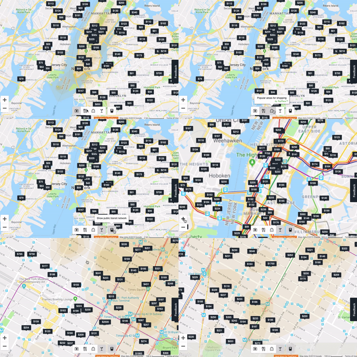
As a user zooms in and out on the map, properties displayed will readjust, and properties that were not initially displayed will appear. Zooming in on the map will not adjust the organic results on the left of the screen. Additionally, the scaling of the heat map will change as a user zooms in so that they can get a better understanding of a property’s location relative to what the heat map highlights. When a user selects any property from the map view, details for that hotel will be displayed above the search results on the left-hand side (as shown below).
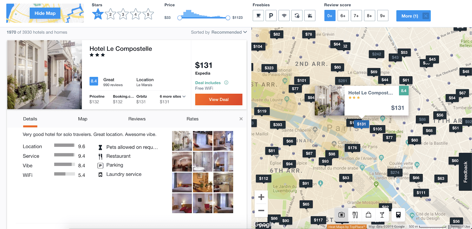
Lastly, above the map view, users have the option to narrow down results using filters including star ratings, price, freebies (breakfast, parking, Wi-Fi, free cancelation, or airport shuttle), review score, and a drop-down menu with many more filters. As filters are applied, the results in both the map and search results are narrowed. In short, the new map feature in Kayak provides users with a holistic view of a property and its location.
Trivago: User Experience Updates
Also looking to enhance the user experience, Trivago has made updates to their calendar feature and is also testing a new approach to hotel filtering.
Calendar Update
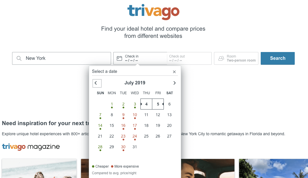
For users with flexible travel dates looking for the best deal, Trivago’s new calendar feature shows which dates are expensive or cheap relative to the average. After a user searches a destination, the calendar will populate with a heat map as they go to enter the check-in-date. The green dots indicate a cheaper nightly rate whereas red dots represent more expensive dates. The heat map calendar feature appears for location searches but is not available for specific property searches.
Question-based Filtering
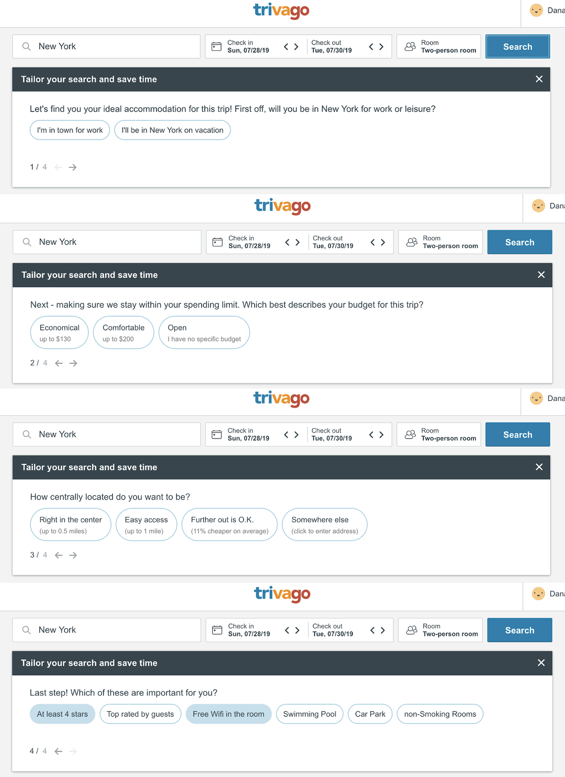
Trivago is testing a new filtering experience that uses four easy questions to tailor a property result set to the user’s precise needs. While we are not certain if the new filtering feature on Trivago has been officially released, the enhanced experience is showing up regularly. After entering a location and check-in dates on the main page, Trivago brings the user to the results page, like usual.
Once they arrive at this page, a box holding the questions displays above the results. Immediately after answering the first three questions, the next question is displayed and the search results adjust to reflect the new filter. The arrows in the bottom left of the box can be used to go back and change an answer or to skip the question. A user can also exit out of the questions at any time. Unlike the first three questions, the last question allows users to select multiple features of a property that are important to them, and it will remain on the screen after the selections have been made.
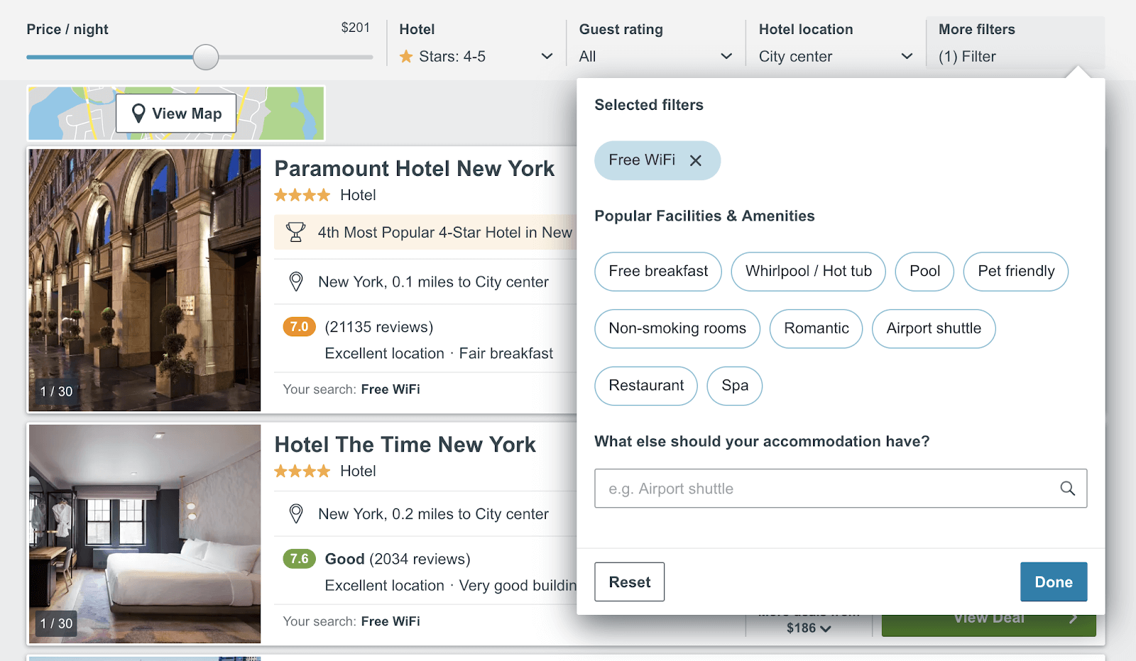
After each question has been answered, the filters reflect the user’s choices. The only question that does not directly correlate to a filter is whether the user plans to travel for business or leisure. This question might stump “bleisure travelers,” a growing group of the millennial travel segment. Trivago’s new filtering process leverages easy to answer questions to tailor the property results to a user’s wants, making it quicker and easier to find their perfect property.
What This Means for Metasearch Advertisers
The impact of the changes to Kayak and Trivago largely depends upon users’ behavior. The use of Trivago’s question-based filters and additional information provided on Kayak’s new map feature, like public transit routes and popular areas, may help reduce clicks that do not lead to conversions. As additional information is provided to users and the results are filtered down to their exact needs, users are less likely to shop through hotels in search of needed information. It is possible that costs will decrease while conversion rates increase – leading to higher returns for properties listed on Kayak and Trivago.
Stay up to date with the latest UI changes to the major metasearch sites. Subscribe to our monthly newsletter here.
You may be interested in
GET IN TOUCH
Ready to get started?
Don’t let your brand get lost in the noise. Partner with Koddi to unlock the power of commerce media and transform the way you engage with your customers. Our team of experts is here to help you navigate complexities and develop a strategy that drives results — no matter what industry – in as little as 45 days.