Blog
New Booking Button Spotted on Google Hotel Ads
Published August 12, 2019
by Justin Lewis

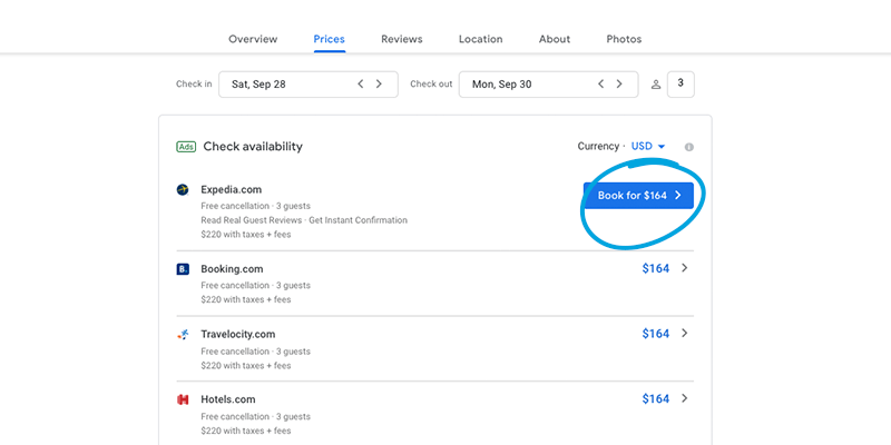
Our team recently spotted a new element on Google Hotel Ad displays. This new feature is a blue booking button for the top-ranked property on Google’s hotel search.

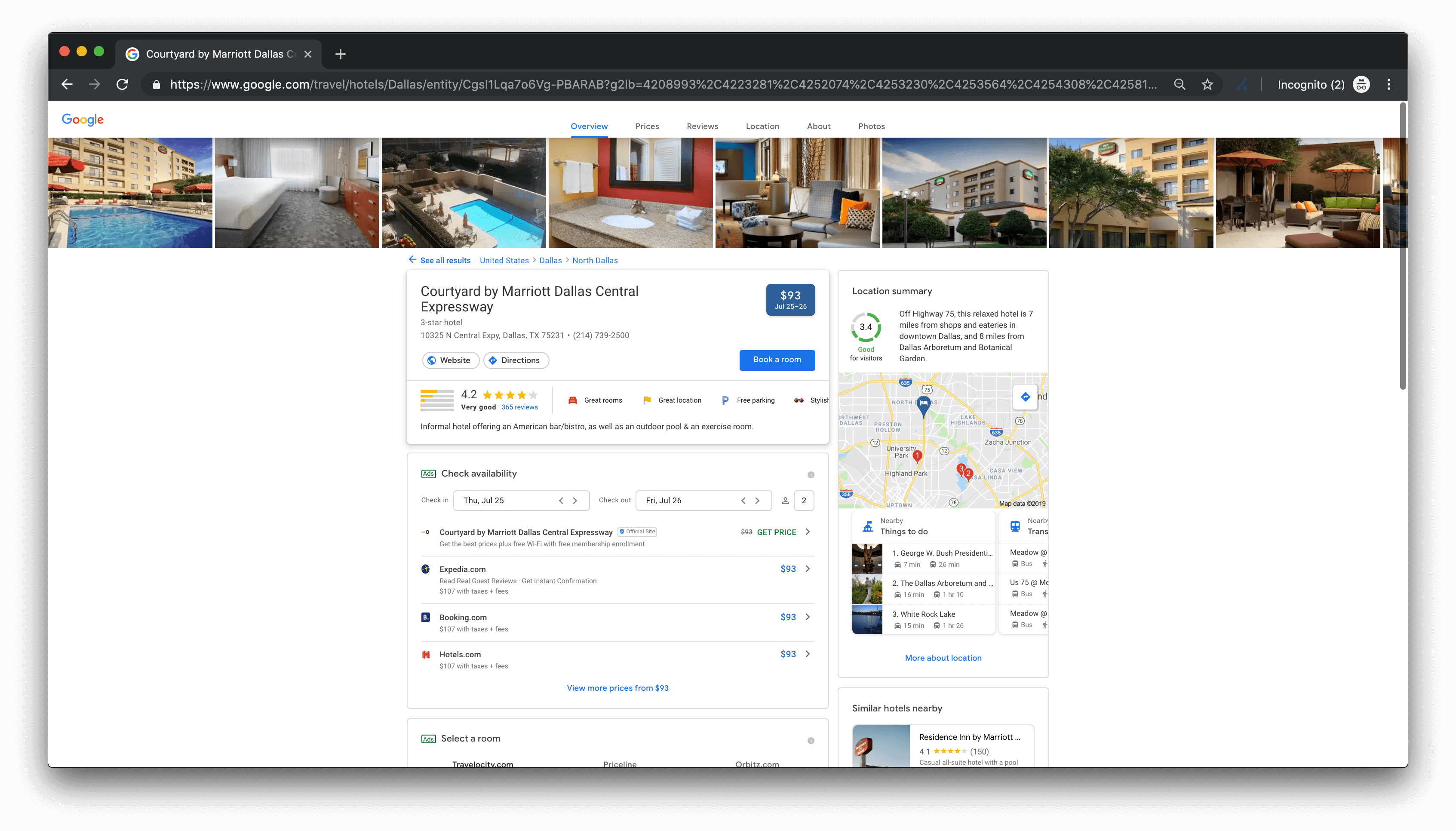
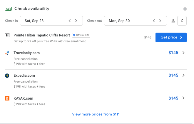
One of our analysts first spotted this new feature while searching Google on a desktop in the US. Although it initially seemed to be a trial aimed at certain subsets of consumers, our recent attempts to find this button suggest that it is now available for the majority of traffic. The previous interface (shown below) did not have a booking button on the first listing. Only the price or a green “Get Price” text was displayed instead. 

How This Could Impact Hotel Campaigns
While these new inclusions may seem minor, they will likely impact click distribution as these buttons further differentiate the top-ranked ad from its neighbors. This is a clearer call to action than the former “Get Price” text. The button is larger, which may draw in consumers and encourage them to click. Following the same reasoning, the click-through rate could be affected. It could also potentially affect the cost-per-click for these ad spots down the line, if the top position does indeed gain a larger share of the click distribution. This could lead to a race for the top spot, if the distribution becomes more top-heavy.
Stay in the Know
Koddi’s team of analysts and product experts are always on the hunt for the latest advertising trends and UI experiments, like this one from Google. To stay up to date on the latest metasearch news, subscribe to our newsletter.
You may be interested in
GET IN TOUCH
Ready to get started?
Don’t let your brand get lost in the noise. Partner with Koddi to unlock the power of commerce media and transform the way you engage with your customers. Our team of experts is here to help you navigate complexities and develop a strategy that drives results — no matter what industry – in as little as 45 days.