Blog
Google Testing a New Hotel Search Experience on Desktop
Published October 18, 2018
by Fernando Nuño

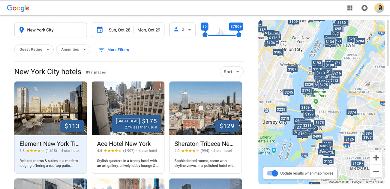
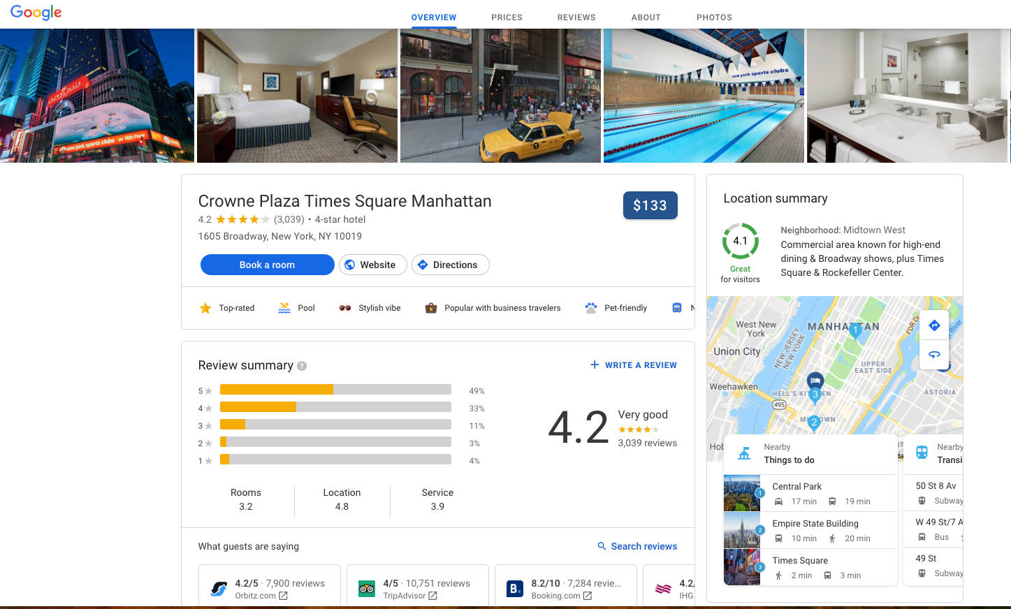
Google has always done its part to stay innovative and make sure its products set the bar. So, it’s no surprise that Google is currently testing a new look to its hotel search engine. With the user in mind, this new desktop experience is as user-friendly as ever, with a cleaner and enhanced modern look as well as newly updated features.
What’s New on Desktop?
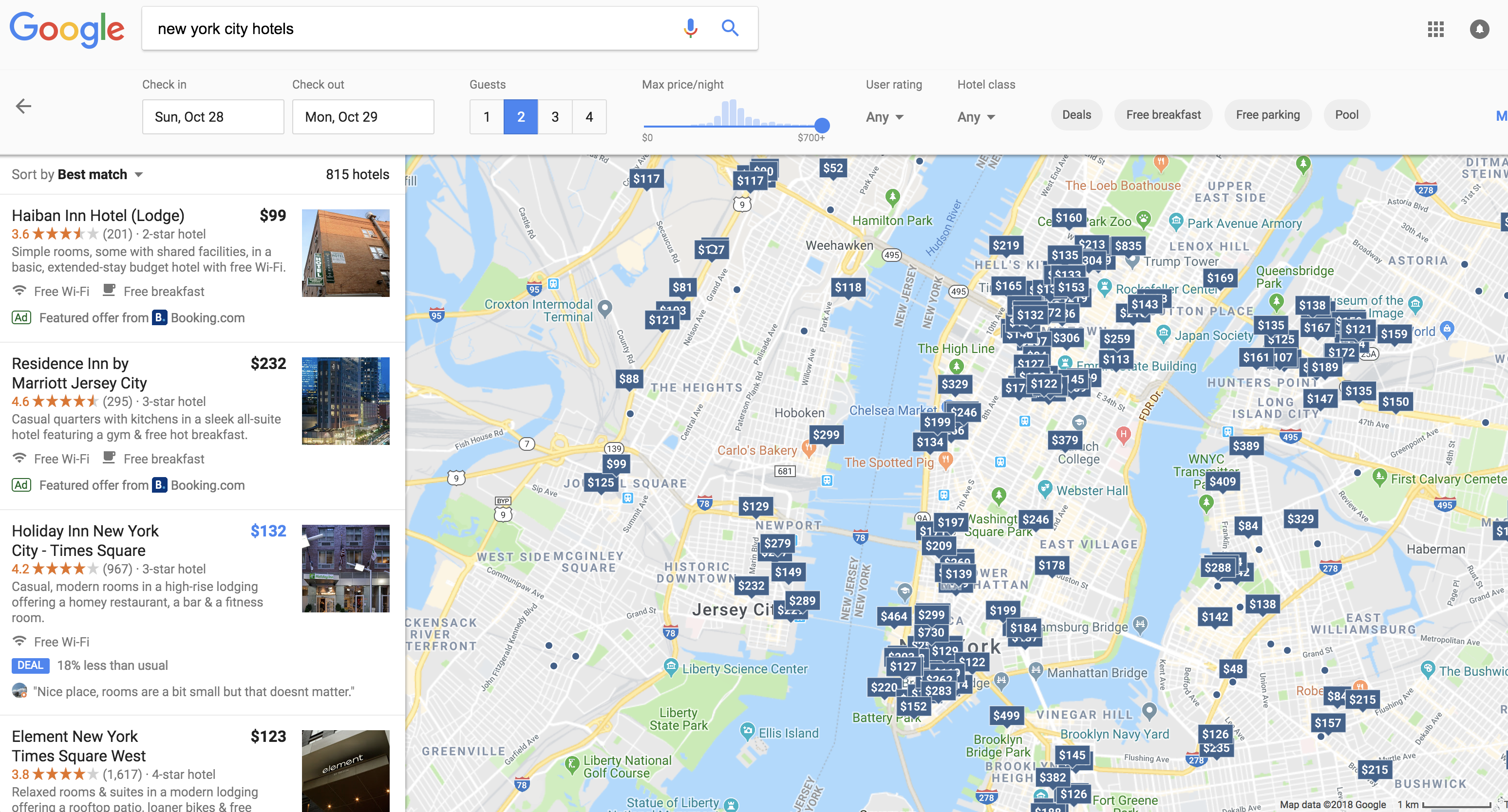
Many of the features between the current experience and this new test experience are consistent but presented in a more user-friendly manner. As seen below, the current layout can be overwhelming to users with multiple options to choose from in New York City. Whereas the image above shows the new test version of the desktop experience which highlights prices and available offers.

Look Familiar?
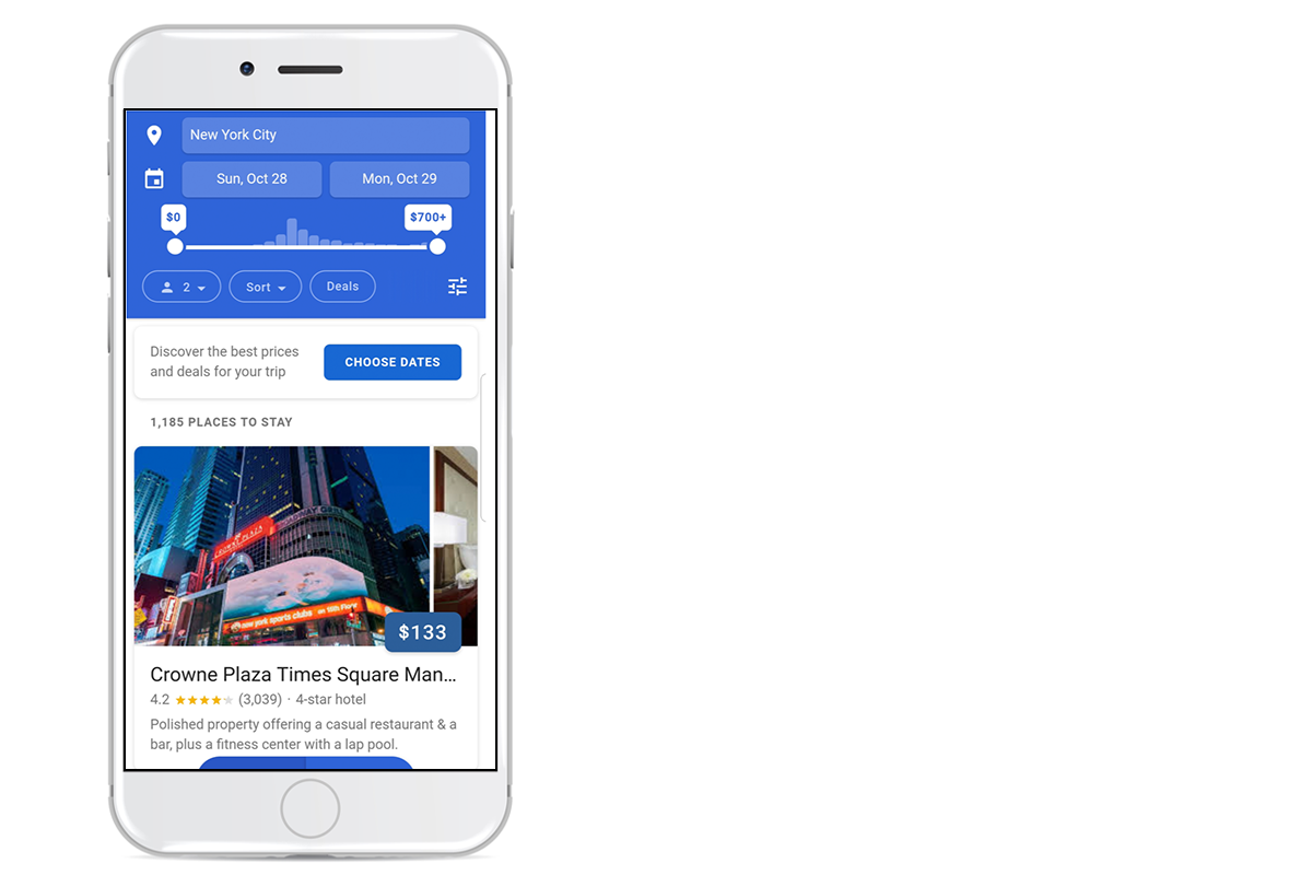
Below is the current mobile experience which looks very similar to the test experience on desktop, but shows 1-2 hotels at a time with the ability to swipe to view more photos as well as easily select parameters for a stay. This current version of the hotel search experience debuted on mobile earlier this year. The end goal for these updates is to provide greater value to the user, satisfy their research needs, and help them book a stay in a hotel that meets or exceeds their expectations. With the new user experience on desktop, additional information is available to help travelers make a decision more efficiently.
You may be interested in
GET IN TOUCH
Ready to get started?
Don’t let your brand get lost in the noise. Partner with Koddi to unlock the power of commerce media and transform the way you engage with your customers. Our team of experts is here to help you navigate complexities and develop a strategy that drives results — no matter what industry – in as little as 45 days.