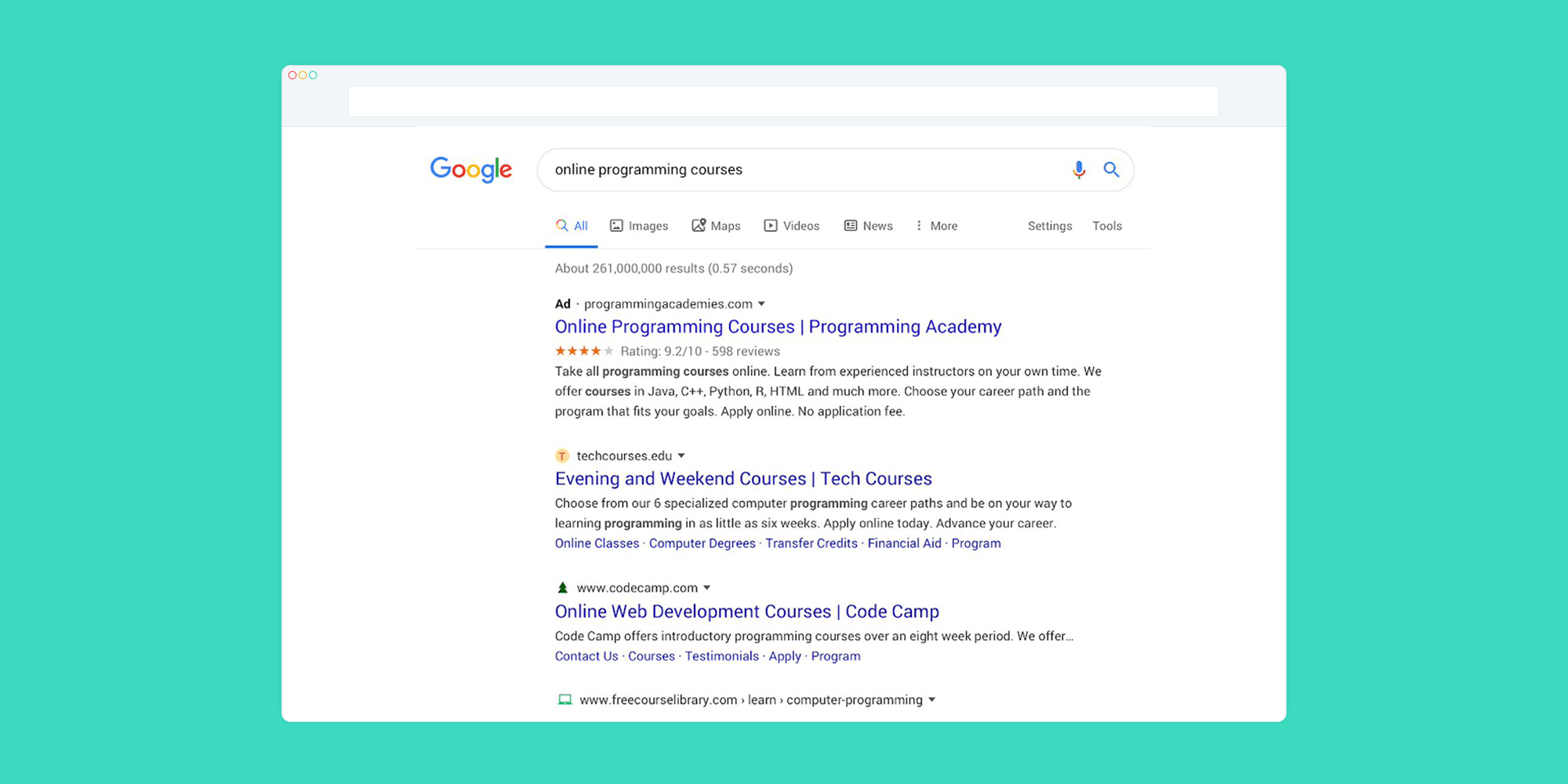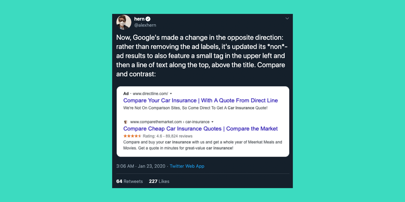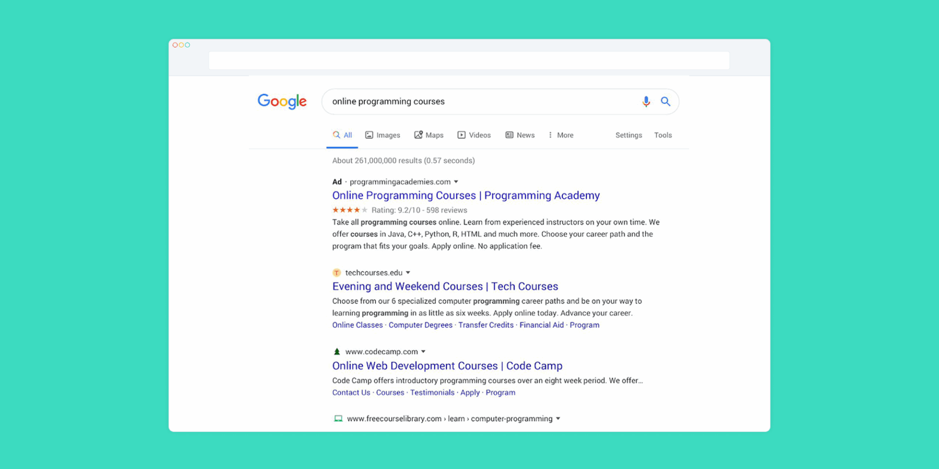
“New year, new me,” or if you’re Google, “new year, new search results UI.” Over the next few weeks, Google will be rolling out new interface tweaks to both paid and organic search results on desktop. Google’s new visual update prominently presents the site domain name and brand icons for organic listings, while paid search is distinguished with a bolded “Ad” label.
This isn’t the first time Google has deployed vanity changes to the search engine. In 2017, Google adopted green text and a green border to distinguish search ads from organic listings. However, content creators were not exactly thrilled with this delineation, as the ad results become almost indistinguishable from organic. According to research by Yard, approximately “41% of users were unable to identify paid adverts on these results.” Then, in 2019, Google released its most recent cosmetic change for mobile devices. Google reported that “a majority of users found it easier to identify websites and more than two-thirds said it was easier to scan results more quickly.”
Google’s redesign of paid ads appears more prominent, while organic listings have the option to display their branding with a favicon. However, early feedback suggests that users are finding the paid results harder to identify and the organic listings cluttered.
The Future of Google: Brand-First Focus
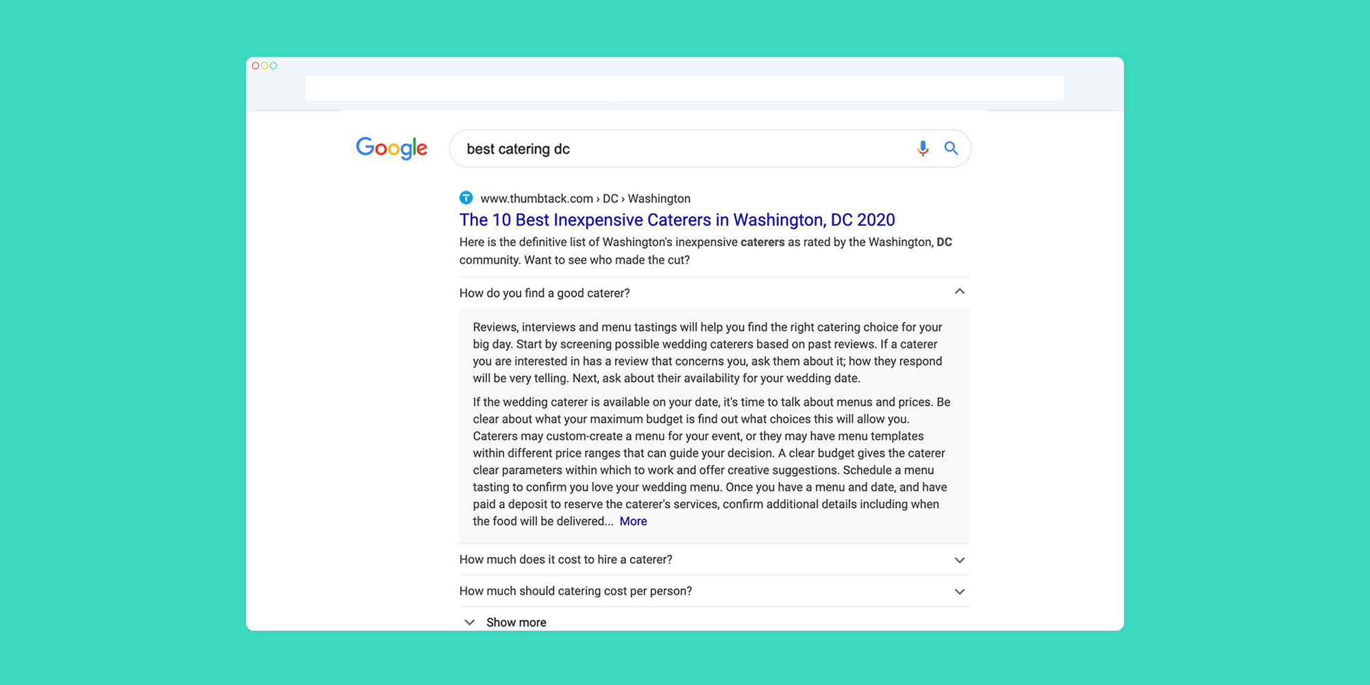
By moving the brand or domain to the first line and adding a favicon for organic listings, the design update reflects a brand-centric approach. Everything from image extensions to answered questions in the organic listing is wrapped into the same “card,” indicating that the content belongs to a single brand.
These small, yet significant changes may provide a glimpse into Google’s shift towards more brand-centric, content curated listings. We must ask how these implications are changing user behavior and what this means for the future of search and advertising on Google.
The Future of Search Ads
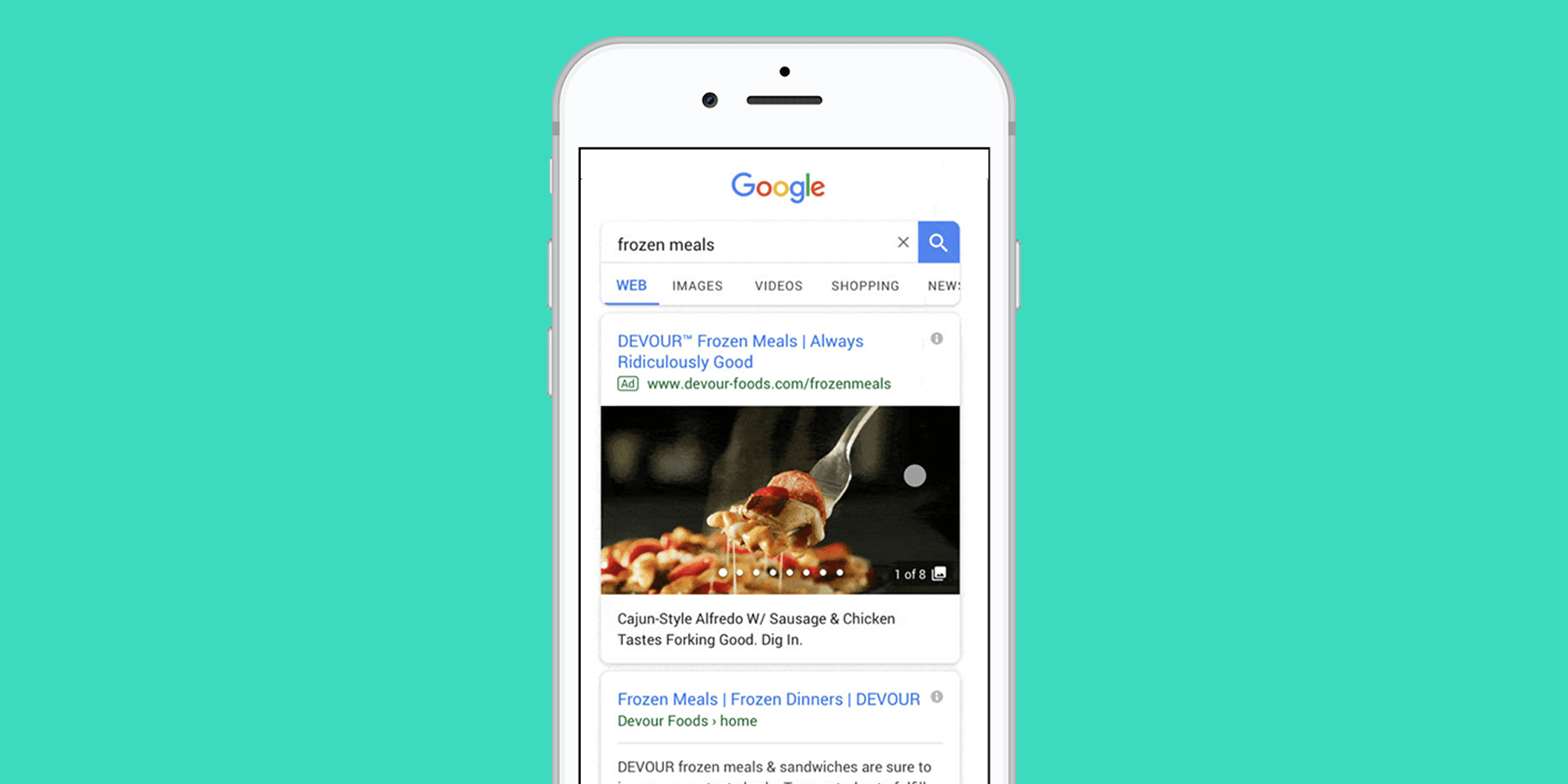
Our interaction with the internet has changed from the early days of browsing a giant encyclopedia mashup to today’s pursuit of a personalized online experience. Synchronously, search listings are shifting from a heavy text-based approach to visually inspiring content. At Google Marketing Live 2019, the search-engine giant made it clear that visual entities are the next big focus for maximizing the reach of consumers at the discovery phase of their buyer journey. This brings us to Google’s rolling product offering called Gallery Ads. Gallery Ads are designed to help businesses showcase their brand with a “card-like” format that can display up to eight swipeable images on mobile. Each image will have the option of a unique caption, and advertisers can utilize a call-to-action button at the end of the gallery. Google’s early tests indicate that Gallery Ads drive 25% more engagement (as measured by clicks and swipes) than standard text ads.
What’s Next?
Are we seeing the next big thing in search engine marketing with 20:20 vision? For now, we will have to wait and see. It is tough to say whether the update will have its typical growing pains while the vanity of the search engine adopts the new look. Certain performance indicators like click-through-rate will reflect the immediate impact. While, in the near future, we will be able to know if these gradual changes are the building blocks for something bigger from Google, or just “smoke and mirrors” as the company continues to maximize the user experience.
Now that we’ve looked at the latest UI updates coming to Google’s search results page, stay tuned next week for Part 2 to learn what advertisers can expect to see in 2020. Follow Koddi on LinkedIn or Twitter to stay informed of our latest blog posts.
You may be interested in
GET IN TOUCH
Ready to get started?
Don’t let your brand get lost in the noise. Partner with Koddi to unlock the power of commerce media and transform the way you engage with your customers. Our team of experts is here to help you navigate complexities and develop a strategy that drives results — no matter what industry – in as little as 45 days.
